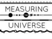
Here's an infographic that answers that question.
Get Started for FREE
Sign up with Facebook Sign up with X
I don't have a Facebook or a X account


 Your new post is loading...
 Your new post is loading...
Your new post is loading...
Here's an infographic that answers that question. 
No comment yet.
Sign up to comment

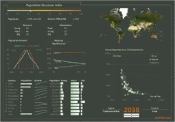
FatFonts [fatfonts.org] is a novel numeric typeface for data visualization purposes. The design of FatFonts is based on Arabic numerals, but the amount of ink (i.e. dark pixels) used for each digit is proportional to its quantitative value. This font enables the reading of numerical data while still preserving an overall visual context.
Curated by Beth Kanter This tumblr blog is a daily post of a chart from the authors of "I Love Charts" - not much commentary - the chart speaks for itself
From
infogr

Infogr.am is world's simplest visual storytelling app. It let's you create infographics and interactive charts in a few minutes.

ghbrett's comment,
June 16, 2012 3:41 PM
Interesting tool. I'll need to figure out how to best use it because I don't do too much quantifiable content.
Curated by Beth Kanter
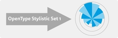
FF Chartwell Font
This font lets you take simple strings of numbers and transform them into charts. The visualized data remains editable, allowing for hassle-free updates and styling. I have been looking for something like this to create better looking charts and graphs than what excel, powerpoint, or survey monkey can do with their built in chart generators which are ugly.
The demo screencast uses Photoshop, so I had look up how to find the Open Type menu for WORD. You have to go to the advanced menus on fonts which is a little arrow underneath the basic font commands. I was hoping I could use in PPT, but PPT does not have Open Type integrated. You can use it in Publisher. It requires exporting as a jpg.
Slightly more tedious but it slowed me down enough to think about how I wanted to present the findings - what was the insight to ask.
There is no data visualization without graphic design and no data art without data.
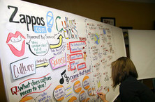
How visual notetaking or graphic facilitation is all the rage in corporations.
|

Curated by Beth Kanter A big hat tip to Lauren Moss, another visual data curator - http://www.scoop.it/t/visual-data for finding this post from Flowing Data blog on data visualization techniques for non graphic designers. This points out the important of simplicity. How can you illustrate your insight as simply and sharply as possible?
Curated by Beth Kanter A curated selection of data visualization tools from datavisualization.ch -- I like the visualization of this resource list. It includes maps, charts, and data.
Curated by Beth Kanter This article from Hubspot lays out some good reasons why marketing has gone visual. The point that resonated for me is: Condenses and Explains Large Amounts of Information What are the new skills that need to condense and explain large amounts of information? Data visualization techniques and visual thinking. I originally re-scooped this piece from Jan Gordon's scoop.it collection for my collection about information coping skills are a new work competency for dealing with information overload. They are also becoming essential skills for marketers.
Curated By Beth Kanter A data visualization competition for journalists shows that data visualization is becoming a new competency for many fields, not just researchers. Description: More than 300 submissions were made across all categories, with Kenyan, Ugandan and Mexican groups and individuals among the entrants. Winner and honourable mentions were chosen by a jury of ten prominent data journalism experts, led by Paul Steiger, editor-in-chief, president and CEO of ProPublica, who emphasised the growing importance of data journalism in newsrooms around the world: The entries came from all over the world, and the six winners and three honorable mentions represented five countries on four continents. The competition clearly showed that digital techniques for capturing and making sense of data are taking their place among the most critical tools of journalism around the globe.
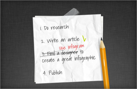
Maybe you want create your own infographic, here 10 tools to support you to do it. [note mg]
Information graphics, visual representations of data known as infographics, keep the web going these days. Web users, with their diminishing attention spans, are inexorably drawn to these shiny, brightly coloured messages with small, relevant, clearly-displayed nuggets of information. They’re straight to the point, usually factually interesting and often give you a wake-up call as to what those statistics really mean.
Who can resist a colourful, thoughtful venn diagram anyway? In terms of blogging success, infographics are far more likely to be shared than your average blog post. This means more eyeballs on your important information, more people rallying for your cause, more backlinks and more visits to your blog. In short, a quality infographic done well could be what your blog needs right now.
Read more: http://bit.ly/K0s4LL Via Martin Gysler, Khaled El Ahmad
|