Journalisme graphique
142.0K views | +0 today
Journalisme graphique
La veille de Wedodata, studio de datavisualisations : wedodata.fr
Curated by Karen Bastien
Your new post is loading...
Scooped by Karen Bastien
Scoop.it!

Vocabulaire visuel du FT

Vocabulaire visuel du FT | Journalisme graphique | Scoop.it
The world today is full of graphics as well as words. Charts, maps and diagrams are ubiquitous, from social media to the boardroom. This makes an ability to interpret and critique them an important part of modern citizenship. So when do we acquire
No comment yet.
Scooped by Karen Bastien
Scoop.it!

Terrapattern : la Terre et ses répétitions de formes

Terrapattern : la Terre et ses répétitions de formes | Journalisme graphique | Scoop.it

Machine learning-based tool to find same patterns in satellite pictures. Tested with solar panels, tennis courts, skate parks. 

No comment yet.
Scooped by Karen Bastien
Scoop.it!

Que peut-on faire avec 2700 Unes de "Vogue", 400 000 pages et 6TB de data ? 

Que peut-on faire avec 2700 Unes de "Vogue", 400 000 pages et 6TB de data ?  | Journalisme graphique | Scoop.it
No comment yet.
Scooped by Karen Bastien
Scoop.it!

Internet : toutes les sources de data

Internet : toutes les sources de data | Journalisme graphique | Scoop.it

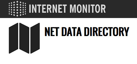
The Net Data Directory collects and shares information on different sources of data about the Internet.

No comment yet.
Scooped by Karen Bastien
Scoop.it!

Cell phone reception in New York Subway

Cell phone reception in New York Subway | Journalisme graphique | Scoop.it
Mapping cell phone reception on the New York City Subway.
No comment yet.
Scooped by Karen Bastien
Scoop.it!

How Much Warmer Was Your City in 2015?

How Much Warmer Was Your City in 2015? | Journalisme graphique | Scoop.it
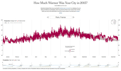
Interactive chart showing high and low temperatures and precipitation for 3,116 cities around the world.
No comment yet.
Scooped by Karen Bastien
Scoop.it!

Datajournalism Literature Explorer

Datajournalism Literature Explorer | Journalisme graphique | Scoop.it

The DDJ Literature Explorer helps you to explore existing research literature on data journalism. It was developed in the course of the paper "Research on Data Journalism: What is there to investigate? Insights from a Structured Literature Review". Over the past years this emerging journalistic practice has been established and has also attracted significant attention from journalism scholars. It was time to take a closer look at the existing research literature in order to find out more about how this literature has been developing.

No comment yet.
Scooped by Karen Bastien
Scoop.it!

Maps That Prove You Don't Really Know Earth

You’ll never trust a map again. Check out more awesome BuzzFeedBlue videos! http://bit.ly/YTbuzzfeedblue1 MUSIC “Phat Hair Day” Licensed via Warner Chappel
No comment yet.
Scooped by Karen Bastien
Scoop.it!

Atlas of United States history

Atlas of United States history | Journalisme graphique | Scoop.it

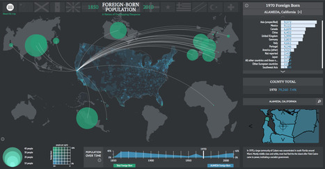
In a collaboration between the Digital Scholarship Lab at the University of Richmond and Stamen Design, American Panorama combines United States history, geographic mapping, and individual narratives to create a visual atlas of history.

No comment yet.
Scooped by Karen Bastien
Scoop.it!

Unfiltered news

Unfiltered news | Journalisme graphique | Scoop.it
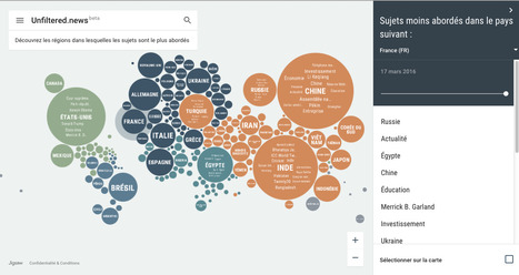
Topics and places the world is reporting on right now. Explore what shapes our different perspectives.
No comment yet.
Scooped by Karen Bastien
Scoop.it!

Medicamentalia, enquête sur les médicaments dans le monde

Medicamentalia, enquête sur les médicaments dans le monde | Journalisme graphique | Scoop.it
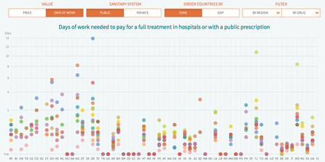
The same pill costs around $1000 in the United States, $320 in Spain and $554 in France. Price differences are much more striking among patented medicines like
No comment yet.
Scooped by Karen Bastien
Scoop.it!

Le Pariteur : changez le sexe de votre fiche de paie

Le Pariteur : changez le sexe de votre fiche de paie | Journalisme graphique | Scoop.it

Les femmes gagnent-elles toujours moins que les hommes ? Pour le savoir, cette web app compare tous les salaires français, tous secteurs confondus.

No comment yet.
Scooped by Karen Bastien
Scoop.it!

Watch Five Years of Oil Drilling Collapse in Seconds

Watch Five Years of Oil Drilling Collapse in Seconds | Journalisme graphique | Scoop.it
The oil crash has taken its toll. Watch five years of oil drilling collapse in seconds
No comment yet.
Scooped by Karen Bastien
Scoop.it!

Pensez-vous comme l'Américain moyen ? 

Pensez-vous comme l'Américain moyen ?  | Journalisme graphique | Scoop.it
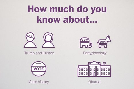
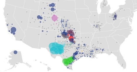
Think you know the mind of the average American voter? We took a look at national polling results, and some of the answers might surprise you. Put your knowledge to the test with our quiz.
No comment yet.
Scooped by Karen Bastien
Scoop.it!

Euro 2016: Mondrian et le foot

Euro 2016: Mondrian et le foot | Journalisme graphique | Scoop.it
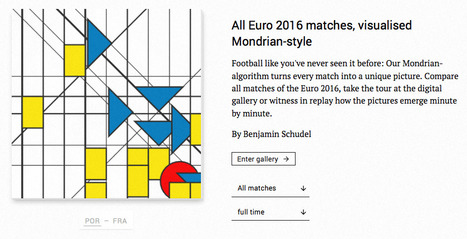
So haben Sie Fussball noch nie gesehen: Unser Mondrian-Algorithmus verewigt jede Partie als Gemälde.
No comment yet.
Scooped by Karen Bastien
Scoop.it!

L'impact d'une nomination aux Oscars sur les bénéfices du film

L'impact d'une nomination aux Oscars sur les bénéfices du film | Journalisme graphique | Scoop.it
No comment yet.
Scooped by Karen Bastien
Scoop.it!

Data + handball = roucoulette

Rio, le magazine des Jeux Olympiques - Invisible avec Luc Abalo et Thierry Omeyer

No comment yet.
Scooped by Karen Bastien
Scoop.it!

Britain's diet in data

Britain's diet in data | Journalisme graphique | Scoop.it
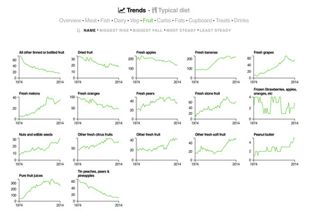
Explore the changes across four decades and hundreds of food and drink categories in this interactive visualisation.
No comment yet.
Scooped by Karen Bastien
Scoop.it!

7 Best Data-Driven TED Talks 

7 Best Data-Driven TED Talks  | Journalisme graphique | Scoop.it
Data visualizations do a fantastic job of explaining the word around us. Here are 7 awesome data-driven TED Talks to spark your creativity. 
No comment yet.
Scooped by Karen Bastien
Scoop.it!

The Curious Journalist's Guide to Data

The Curious Journalist's Guide to Data | Journalisme graphique | Scoop.it
No comment yet.
Scooped by Karen Bastien
Scoop.it!

Global Diplomacy Index

Global Diplomacy Index | Journalisme graphique | Scoop.it
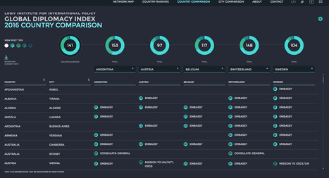
Compare the diplomatic networks of up to five G20 & OECD countries
No comment yet.
Scooped by Karen Bastien
Scoop.it!

Shakespeare’s “Much Ado About Nothing” en dataviz

Shakespeare’s “Much Ado About Nothing” en dataviz | Journalisme graphique | Scoop.it
A visual reinterpretation of William Shakespeare's famous play
No comment yet.
Scooped by Karen Bastien
Scoop.it!

Les cinquante cartes de Charles-Joseph Minard 

Les cinquante cartes de Charles-Joseph Minard  | Journalisme graphique | Scoop.it
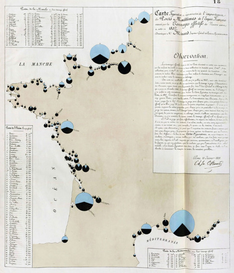
Ingénieur de formation, Charles-Joseph Minard (1781–1870) est devenu une sorte de « superstar » de la visualisation de l'information. Il doit sa (...)
No comment yet.