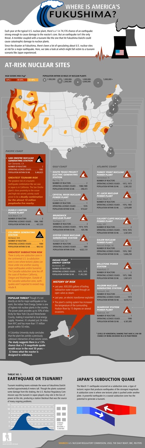
The following map is part of this map series, showing the amount of new factual programming received by different countries on British television in 2010.
Get Started for FREE
Sign up with Facebook Sign up with X
I don't have a Facebook or a X account


 Your new post is loading...
 Your new post is loading...
Your new post is loading...
The following map is part of this map series, showing the amount of new factual programming received by different countries on British television in 2010.

No comment yet.
Sign up to comment

Explore different types of American households and see how they have changed over time.
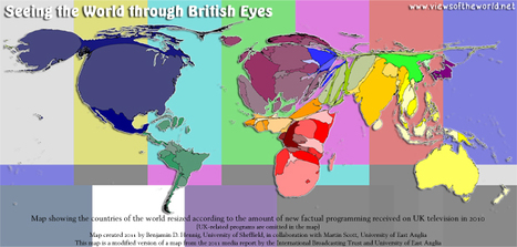
Roadmap 2050 publie un gros rapport technique sur une Europe zéro carbone, mais n'oublie les visualisations et en publie même un volume à part : http://www.roadmap2050.eu/attachments/files/Volume3_FullBook.pdf

For this map, we asked the Cluster Mapping Project at Harvard Business School to provide the top 20 job-creating areas for the following fields: Plastics, Chemicals, Automotive, Aerospace vehicles, Information technology, Biopharma, Metal manufacturing, Communication technology, Medical technology, Analytical instruments, and Electrical equipment.
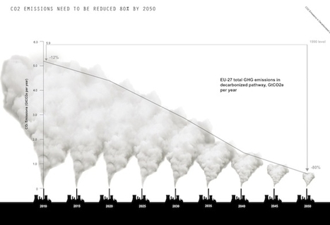
How does the recent dry weather compare to previous years in the UK?
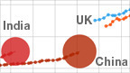
Track how Asian economies compare with the UK and the US on key indicators like GDP and life expectancy.
|

this map shows the countries that the TI Defence and Security Programme is engaged with, including those that have sent participants on building integrity courses, used TI-DSP tools and resources, attended conferences or workshops, contributed to TI-DSP research projects, and/ or worked with the TI national chapters on defence-related issues.
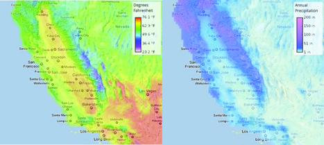
California residents can access Cal-Adapt, a site that crunches environmental data and allows you to see what the temperature increase will be in your town (or even neighborhood) through 2050.
From
www

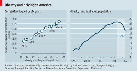
There's a striking correlation between driving and obesity. Could a future with fewer cars help reverse one of our most pressing health crises?
L'Insee anime enfin ses bases de données : la pyramide des âges en dynamique
Projet remarquable sur les migrations de population dans le monde par Carlo Zapponi, design technologist (son site www.makinguse.com)
The goal of this approach was to provide an overview of the entire play by showing its text through a collection of the most frequently used words for each character. A scene is represented by a block of text and scaled relatively according to its number of words. Characters are ordered by appearance from left to right throughout the play. The major character’s speeches are highlighted to illustrate their amounts of spoken words as compared to the rest of the play.
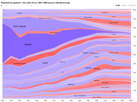
The following charts from the UC Berkeley Visualization Labs show every occupation's share of the labor force over time, with male workers in blue and female in red.
In a seven-part series, Guardian and Observer critics chart the history of modern music, tackling a different genre each day and picking 50 key moments.
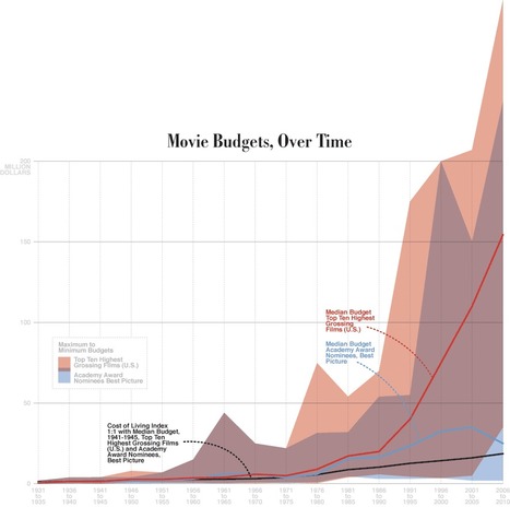
Blog spécialisé dans les infographies liées au cinéma. Et oui, les graphes, ce n'est pas que pour l'économie !
|