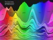
Looking to get noticed in the art world? Then pick your manifesto's theme from this graphic.
Get Started for FREE
Sign up with Facebook Sign up with X
I don't have a Facebook or a X account


 Your new post is loading...
 Your new post is loading...
Your new post is loading...
Looking to get noticed in the art world? Then pick your manifesto's theme from this graphic.

No comment yet.
Sign up to comment

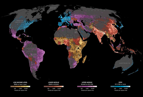
An interactive map showing the population of Asian groups throughout New York City and their growth since the year 2000.
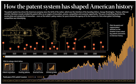
The patent system has driven the American economy since the birth of the nation. View the history of innovation in America through the lens of patents in an interactive timeline, charts and graphs.
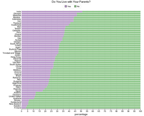
This chart shows the result of (one question) survey conducted by the World Values Survey (WVS) about housing: Do you live with your parents? What is World Values Survey?
Data Pointed is the home of artist and scientist Stephen Von Worley's data visualization research; a journal of interesting information imagery and news from around the world.

Des schémas qui illustrent quelques géants comme Google, Facebook, Apple, Microsoft...etc.
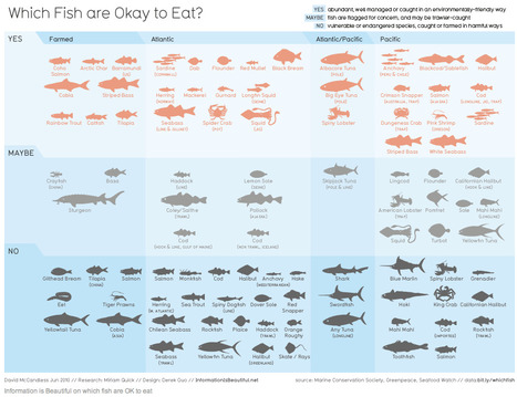
Voici une très belle infographie qui classe les poissons en trois catégories, les poissons à manger, ceux que l'on peut ... (RT @VeilleSMO: Manger des poissons oui mais lesquels?
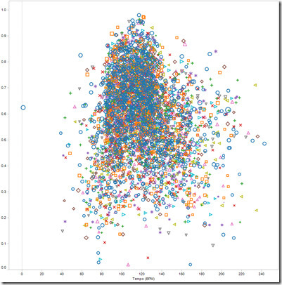
Rutgers students Shaun Ellis and Thomas Engelhardt tried to discover the secrets sauce behind a “hit” song by analyzing 4,200+ songs that made it to the top ten of Billboard’s Hot-100 chart.

Où se trouve le scanner le plus proche? Où se trouvent les appareils d'IRM en France? Julien Kirch ouvre pour vous les données du ministère de la santé.

This visual technique provides insight into the intensity of various crime types across region in Chicago.
|
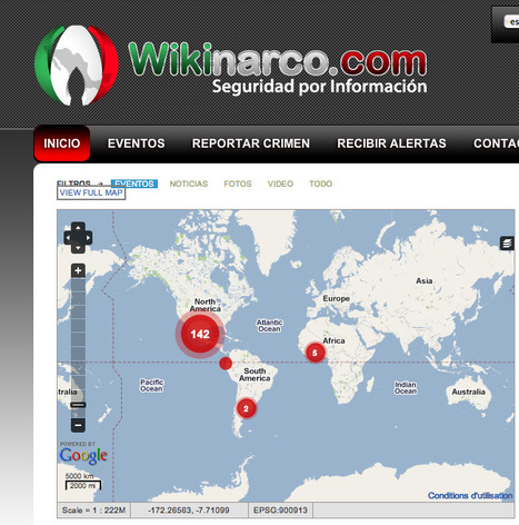
Désormais, un Wiki Narco pour regrouper toutes les infos sur les mafias de la drogue. Avec tous les outils sociaux représentés.

Le Monde.fr - A Paris, le prix du mètre carré à la vente n'a jamais été aussi élevé.
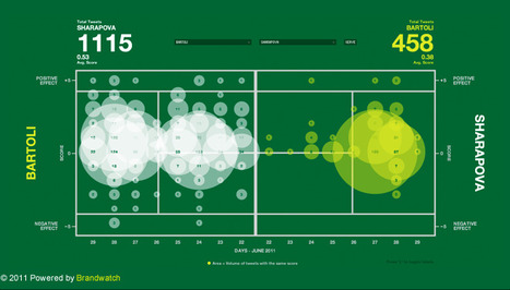
BrandWatch profite de Wimbledon pour mettre en scène les twitts échangés pendant la compétition.
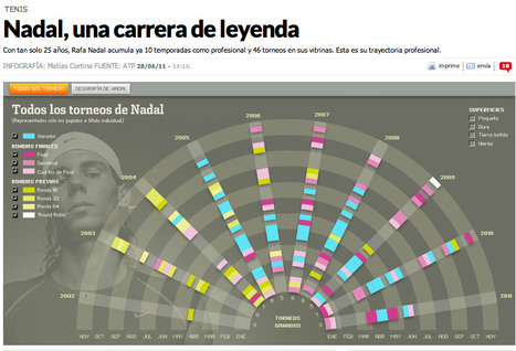
Nadal, una carrera de leyenda - Con tan solo 25 años, Rafa Nadal acumula ya 10 temporadas como profesional y 46 torneos en sus vitrinas. Esta es su trayectoria profesional.
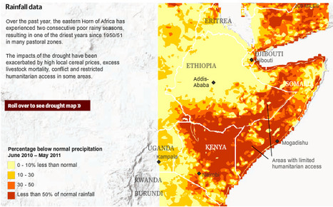
Some 10 million people are at risk in the Horn of Africa as two years of drought have forced food prices beyond the reach of most families...

From
nskyc

The average color of the New York City sky, updated every 5 minutes.

The first map of sea-ice thickness from ESA’s CryoSat mission was revealed today at the Paris Air and Space Show.
People are incorrectly using the term infographics all over the web and I think we need to put a stop to this practice.

Using Android cell phones, combined with GPS and Google Earth software, FLOW gives community members, partners, volunteers, and others the ability to record data from tens of thousands of water points around the world.

Cette infographie en présente un peu plus sur ce domaine qui se fini toujours de manière polémique entre les utilisateurs et le service qui veut se rémunérer...
|